Awaked Coffee
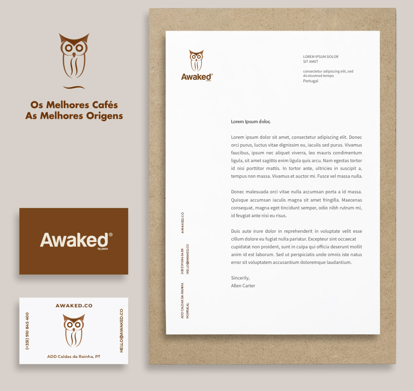
Awaked was a challenging project. The first stage, Naming and the creation of the Visual Identity, was based on the principle that coffee is not only a product that brings together flavor and health, but is above all a stimulus product. Thus, we worked on the Brand in order to convey the sensation of awakening: in the union between the visual element, the coffee bean which is the stimulus that awakens and, in the owl, as a symbolic representation of agility and speed.
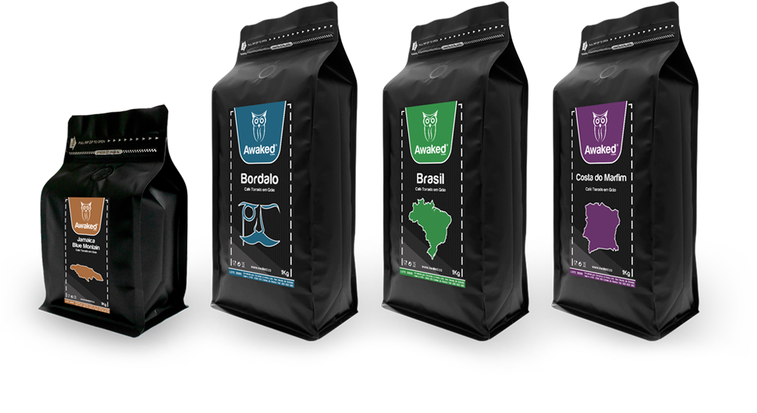
The packaging, in black and with a velvety texture, synonymous with quality, has been applied graphics that refer to the origin and flavor of the coffee.
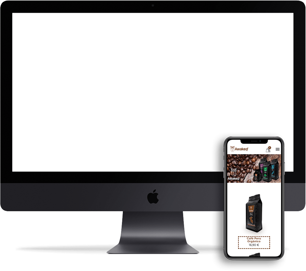
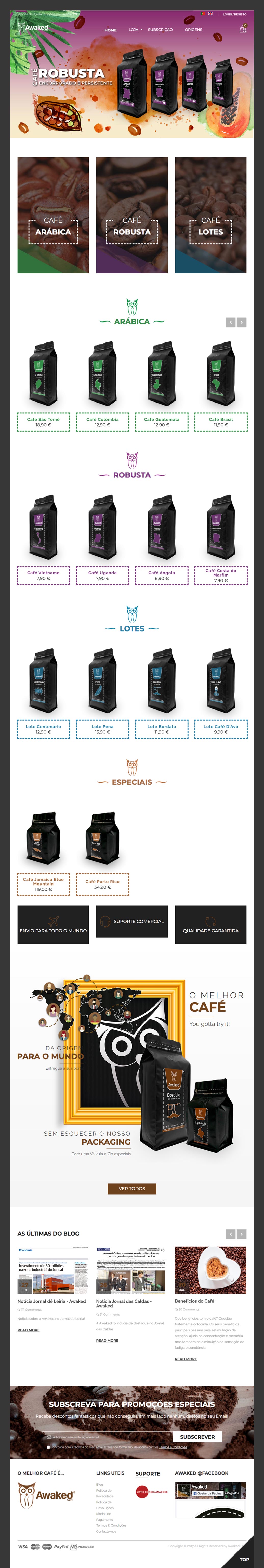
We were also responsible for the development of the online store which, in addition to offering the option of purchasing, stands out for its subscription area. 100% responsive and with a backoffice tailored to your needs.
Branding
Packing
Online store
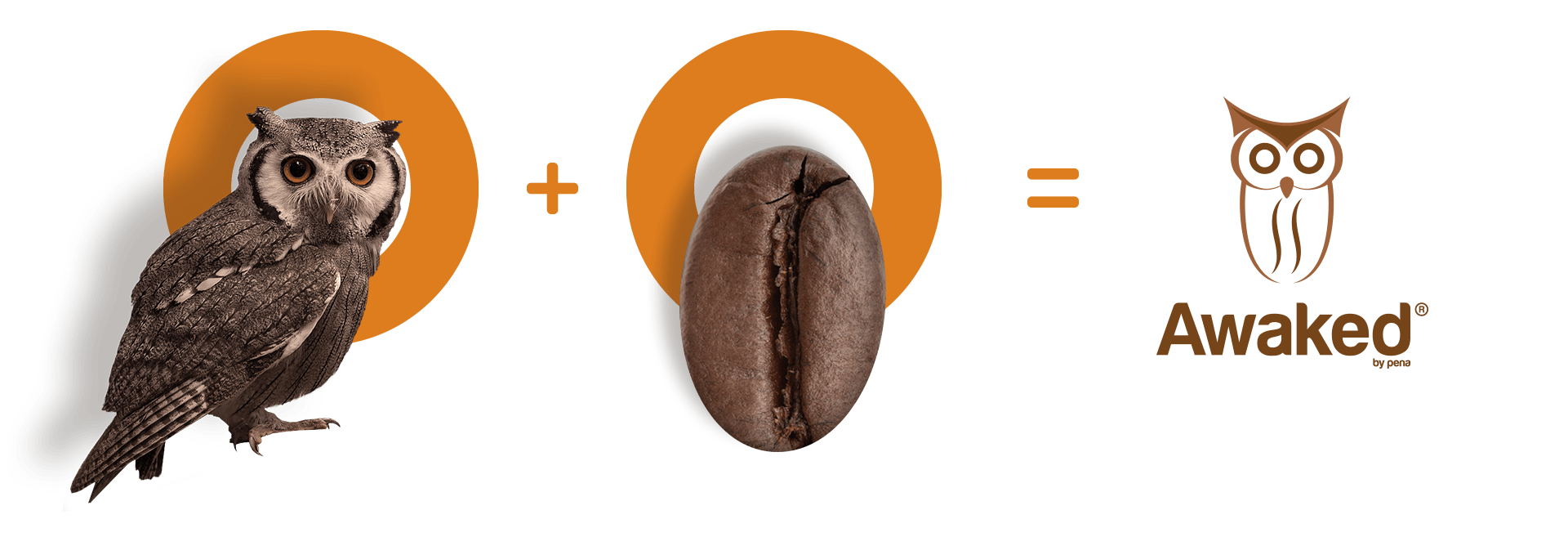
- Owl
- night bird
- wisdom
- speed
- agility
- Coffee bean
- awakening
- determination
- stimulus
- rejuvenate